- Subscribe to RSS Feed
- Mark as New
- Mark as Read
- Bookmark
- Subscribe
- Email to a Friend
- Printer Friendly Page
- Report Inappropriate Content
In a recent blog post,
I described AChartEngine open source software. It is a
freely-available library which can be linked with your Android apps to
produce beautiful graphical output in the form of customizable graphs
and charts. You can find AChartEngine at http://www.achartengine.org. It is licensed with the business-friendly Apache Version 2 license, and does not require redistribution of any modified sources or linked binaries.
AChartEngine is documented through Javadoc pages
explaining the API. There is also a sample project, and the
source code itself. The sample project, the library jar files and
the Javadocs are at http://code.google.com/p/achartengine/downloads/li
Recently,
I spoke with android developer Dan Dromereschi, the brains behind the
design and implementation of AChartEngine. Dan explained that he
open sourced his work, in part, to allow other developers to maintain
and improve the code, now that Dan has taken on additional
projects. If you’re interested in working on AChartEngine,
email Dan at contact@achartengine.org. That would be a great way
to extend your Android knowledge.
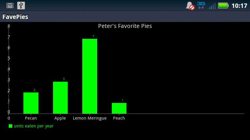
Here’s a simple bar chart that I built using AChartEngine. It’s a bar chart showing my favorite baked pastry goods.

Figure 1: Peter's Pie Preferences
As Figure 1 indicates, lemon meringue is my favorite flavor of pie. I managed to polish off 7 of them in the last year (hey! with the help of a large family, I hasten to add, and we average about one pie a month). The code to draw that graph is simple and straightforward. First comes the package name, and all the numerous imports.
package com.example.favepies;

import java.util.ArrayList;
import java.util.List;

import org.achartengine.ChartFactory;
import org.achartengine.chart.BarChart.Type;
import org.achartengine.model.CategorySeries;
import org.achartengine.model.XYMultipleSeriesDataset;
import org.achartengine.renderer.SimpleSeriesRenderer;
import org.achartengine.renderer.XYMultipleSeriesRenderer;
import org.achartengine.renderer.XYMultipleSeriesRenderer.Orientation;

import android.app.Activity;
import android.content.Intent;
import android.graphics.Color;
import android.os.Bundle;
MOTODEV Studio is very helpful about locating any imports that you need, and writing the statements for you. I frequently write code without import statements, let the compiler flag the errors, and then resolve them by letting Studio write the necessary import clause.
Next comes the MainActivity. All that does is build an Intent, and fire it, so the graphing software can kick in.
public class MainActivity extends Activity {
    /** Called when the activity is first created. */
    @Override
    public void onCreate(Bundle savedInstanceState) {
        super.onCreate(savedInstanceState);
        Intent intent = createIntent();
        startActivity(intent);
    }


    public Intent createIntent() {
        String[] titles = new String[] { "units eaten per year", " " };
        List<double[]> values = new ArrayList<double[]>();
        values.add(new double[] { 2, 3, 7, 1 });
        values.add(new double[] { 0, 0, 0, 0});

        int[] colors = new int[] { Color.GREEN, Color.BLACK };
        XYMultipleSeriesRenderer renderer = buildBarRenderer(colors);
        renderer.setOrientation(Orientation.HORIZONTAL);
        setChartSettings(renderer, "Peter's Favorite Pies", " ", " ", 0,
            8, 0, 8, Color.GRAY, Color.LTGRAY);
        renderer.setXLabels(1);
        renderer.setYLabels(10);
        renderer.addXTextLabel(0.75, "Pecan");
        renderer.addXTextLabel(1.75, "Apple");
        renderer.addXTextLabel(2.75, "Lemon Meringue");
        renderer.addXTextLabel(3.75, "Peach");
        int length = renderer.getSeriesRendererCount();
        for (int i = 0; i < length; i++) {
          SimpleSeriesRenderer seriesRenderer = renderer.getSeriesRendererAt(i);
          seriesRenderer.setDisplayChartValues(true);
        }
        return ChartFactory.getBarChartIntent(this, buildBarDataset(titles, values), renderer,
            Type.DEFAULT);
      }
The Intent is a BarChartIntent, because I know I want a bar chart. The Intent has two main pieces of data
- the bar chart data and titles. Here, I'm using literals, but you could equally well retrieve dynamic values from a server.
- a Renderer, which is the class that has all the knowledge about how to turn data into colored lines or shapes. In this code, I add information to the renderer to tell it the colors to use, and labels to put on the axes.
The final piece of code are three utility methods that store lots of configuration settings and data into the renderer and the bar dataset.
    protected XYMultipleSeriesRenderer buildBarRenderer(int[] colors) {
        // creates a SeriesRenderer and initializes it with useful default values as well as colors
        XYMultipleSeriesRenderer renderer = new XYMultipleSeriesRenderer();
        renderer.setAxisTitleTextSize(16);
        renderer.setChartTitleTextSize(20);
        renderer.setLabelsTextSize(15);
        renderer.setLegendTextSize(15);
        int length = colors.length;
        for (int i = 0; i < length; i++) {
          SimpleSeriesRenderer r = new SimpleSeriesRenderer();
          r.setColor(colors[i]);
          renderer.addSeriesRenderer(r);
        }
        return renderer;
      }

    protected void setChartSettings(XYMultipleSeriesRenderer renderer, String title, String xTitle,
    	      String yTitle, double xMin, double xMax, double yMin, double yMax, int axesColor,
    	      int labelsColor) {
    // sets lots of default values for this renderer
            renderer.setChartTitle(title);
    	    renderer.setXTitle(xTitle);
    	    renderer.setYTitle(yTitle);
    	    renderer.setXAxisMin(xMin);
    	    renderer.setXAxisMax(xMax);
    	    renderer.setYAxisMin(yMin);
    	    renderer.setYAxisMax(yMax);
    	    renderer.setAxesColor(axesColor);
    	    renderer.setLabelsColor(labelsColor);
    }

    protected XYMultipleSeriesDataset buildBarDataset(String[] titles, List<double[]> values) {
    // adds the axis titles and values into the dataset
        XYMultipleSeriesDataset dataset = new XYMultipleSeriesDataset();
        int length = titles.length;
        for (int i = 0; i < length; i++) {
          CategorySeries series = new CategorySeries(titles[i]);
          double[] v = values.get(i);
          int seriesLength = v.length;
          for (int k = 0; k < seriesLength; k++) {
            series.add(v[k]);
          }
          dataset.addSeries(series.toXYSeries());
         }
        return dataset;
    }
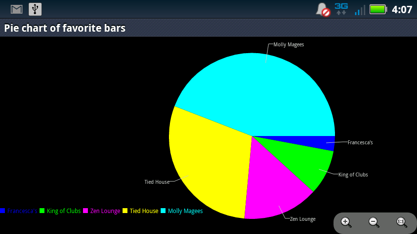
That's the complete code. Here's the graph I presented in the first post on this topic.

In the previous post, I showed you a pie chart of my favorite bars. In this post, I presented a bar chart of my favorite pies. All I need to do now is write a sample using the AChartEngine class DoughnutChart (really), and my work here is done.
How do you draw graphs in your Android apps? Please follow up with a post describing your thoughts.
Peter van der Linden
Android Technology Evangelist


